What Makes a Good infographic?
Infographics are taking over the earth! At least it seems that way. There has been an explosion of infographics on the web — in both B2C and B2B — literally illustrating that a picture is indeed worth a thousand words. But before we get into what makes a good one, let’s define what an infographic is and why they have reached the tipping point.
Infographics are graphical representations of content that would alternatively require a lot of words or that would be difficult to glean without previous knowledge of the subject. So, it is essentially visual shorthand for weaving a qualitative story, often from quantitative content.
The facility for rendering complex data in simpler terms is a coveted skill. The way in which people absorb content on the web these days is like a butterfly flitting from flower to flower. Attention spans are short and getting shorter as is time to focus and reflect. If content creators can distill complex narratives into compelling, easy-to-comprehend visuals, visitors to their websites are more likely to engage with them.
Infographics can be a part of any digital marketing campaign. With Javascript animations, strong use of color and fonts, intuitive icons and illustrations all optimized for Search, infographics can build your backlinks, improve organic traffic, wow your audience and strengthen your brand.
The key ingredients of a good infographic are:
- A cohesive and coherent story line
- A series of concise, clearly worded headlines from which one can “get the gist”
- Simple storytelling graphic style, Icons can work very well
- Simple, clean font style, avoid lots of flourishes
- Not trying to do “too much”
- Test out the graphic among lay people before releasing to a wider audience
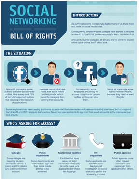
Here are a few infographics I’ve come upon lately, which do a particularly good job making a lot of content easy to digest.

Not surprisingly, HubSpot has created and compiled a top ten collection of cool infographics related to the field of marketing. Each represents a different concept and is rendered in a different visual format. The configuration of text, graphics, fonts, icons and colors is chosen specifically to solve the visual problem. The great thing about Infographics is that they grow organically from the data so developing one is a unique creative experience yielding a unique result. Because of their custom nature, most infographics are not template based, although I’ve seen a few starter infographic toolkits mostly directed toward non-designers. These may be helpful for people not comfortable visualizing, but tend to yield more cookie cutter solutions.
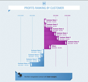
This Fast Company interactive infographics depicts the multiple ways a business can rank its profits, such as by project, by state, by customer and so forth. This one is actually a collection of single infographics representing one view of company profits at a time, which can be accessed by simply clicking an arrow.
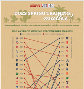
For sports fans, this infographic provides 10 years of data on whether spring training improves batting averages.


