What Science Can Tell us About Color and Design

Family lore has it that my design career began at age 4 when after a rain storm I came upon an oil slick in our driveway and was so astonished by the rainbow of colors that I grabbed my crayons and started to draw. Working with color has always been a pleasurable and highly intuitive and experience for me. But lately, there has been a growing number of research studies and articles about the science of why we respond a particular way to colors and design in general, which have implications for business as well as being of academic interest.
“Color Me Creative: Study Says Green Sparks Inventiveness,” a recent German study cited in the Huffington Post, engaged participants in a series of creative tasks and exposed them to different colors prior to their tasks. Those exposed to the color green, produced the most creative responses. The article posits that green is the color of growth and that we associate green with freshness, healthy food and nourishment. It may explain why many hospitals interiors are painted green and increasingly include landscape art in waiting rooms and corridors. Perhaps it’s intuitively what made me paint our offices in varying shades of green years ago.
In this Sunday’s New York Times Sunday Review section, an article titled, “Why We Love Beautiful Things,” discusses how neuroscience is being applied to unlocking how good design works. Behind this notion is the idea that understanding how design works can lead to more productivity and less stress in the workplace, stress-related illness being a $300 a year billion expense in this country.
The article also touches upon the validity of the golden rectangle. For two millennia, philosophers, artists and architects have been creating work in a proportion known as the “Golden Rectangle,” which has provided the structure for countless architectural and artistic masterpieces, such as the Parthenon, Notre Dame and the Mona Lisa to name a few. While it has always been accepted that the golden rectangle is a pleasing proportion, a Times article sites a 2009 Duke University study that verified that our eyes actually scan images fastest when their shape is the golden rectangle.
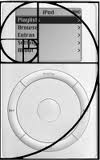 So, it should come as no surprise that the original iPod was designed in the golden rectangle proportion.
The subject of how science informs and substantiates design and the many— often hidden—ways design impacts business are subjects for further exploration, which I’ll address in future posts.
