What the New iPad Resolution Means for Your Website
 A couple of years ago it became quickly evident how ubiquitous the iPad had become amongst our C-level and VP clients. I recall making a critical first website design presentation to a new client only to find the CEO disconcertingly playing on his iPad while I was presenting. After a few minutes of this, the CEO looked up with a grin and showed us his screen on which was our website design in perfect proportion with great resolution. He was quite pleased, and it confirmed to us that the device criteria on which we tested our work had officially expanded.
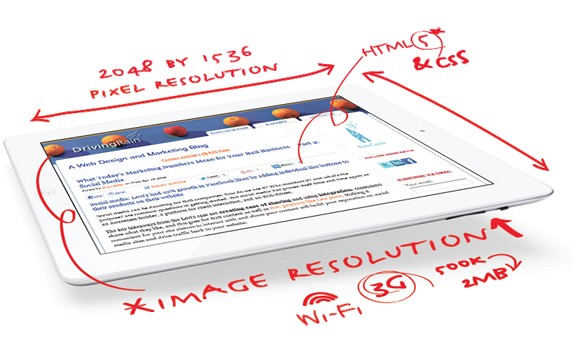
The new iPad presents an interesting twist. With literally four times the number of pixels – on the same size screen – resolution literally twice that of the previous model, there has been nothing but raves about the clarity and sharpness of images and text.
However, one consequence we’re also hearing is that because of this clarity, websites designed for the standard screen resolutions for laptops, desktop monitors, iPads and other tablets, now appear grainy and dull on the new iPad. This is especially true of web images that contain text.
In order to compensate for Apple’s advanced technology, we can recreate each image at a higher resolution and thereby take advantage of the crystal clarity the new iPad affords. However, in creating the higher resolution image, the file size naturally increases, which will affect the time it takes to load a page and its images.
{{cta(‘4347af66-fa69-4568-8c00-45a7a523fc9e’)}}
However, the new iPad, despite its popularity, only accounts for a miniscule share of internet viewing. Should all users have to “pay the price” of higher resolution images?
Consider mobile phone users, a much larger audience than tablet users; they will not see any difference on their low-res, small screens. And chances are they would not like to see their bandwidth usage skyrocket as a result of higher resolution images.
Apple itself has taken to replacing it’s old images with high resolution versions when delivering to the new iPad – and only on selected pages. Reportedly, their home page blossomed from about 500k to over 2MB (4x!) when being delivered to a new iPad. This might give pause to people using their iPad over a bandwidth limited 3G/4G connection.
This approach may be a reasonable interim solution for those who feel the need to deliver an iPad- optimized experience. But it requires additional coding and image manipulation work to be done.
Clearly a better solution is necessary as the world of devices, screen sizes and resolution expands. A variety of work is underway in the areas of responsive design, browser support, HTML and CSS. But the cat is out of the bag now, and we will be faced with dealing with this until such solutions are generally available.
What do you think?
