5 Examples of Effective Calls-to-Action
Calls-to-action are the pick-up lines of Internet marketing; if you don’t have a good opener your efforts are lost almost immediately.
In creating a lead generation campaign, an effective call-to-action (CTA) is necessary to drive initial interest in your offer. At it’s most basic, a good CTA should:
- Be branded
- Be eye-catching
- Have proper page placement
- Have clear messaging
Beyond this, there are different elements that make up an effective CTA. We’ve put together a list of fantastic CTA examples that encompass best practices, which you could use on your future CTAs.
Priceline
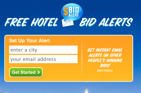
Immediately, the slanted, all-caps font Priceline uses on its bid alerts tool creates a sense of immediacy. The terms “alert” and “instant” capitalize on a feeling of urgency in using this tool, and the visitor is easily convinced that the end benefit is worth the simple two-form first step. By including the minimum first step of the process in the CTA, Priceline is already driving more conversions than saddling visitors with one long form.
PayPal
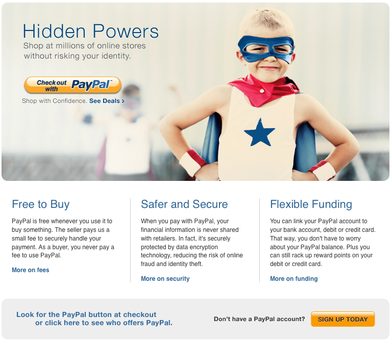
PayPal plays on humor and a sense of ease as its CTA’s first impression tactic. The CTA is branded in PayPal’s clear messaging: “We take something dangerous and make it safe, so you can rest easy.” The considered use of blue and orange company colors enhances this idea that PayPal’s got your back. It also highlights the three most important benefits of signing up with simple wording “Free to Buy,” “Safer and Secure,” “Flexible Funding,” and uses personalized language and a concentration on “you” to connect with the visitor.
Barack Obama

Politics aside, President Obama has capitalized on Internet marketing from the early days of his 2008 campaign. His entire homepage is essentially a compilation of CTAs, with the most important one sponsored at the top in prime real estate and rotated in a timely manner. Currently, his “Dinner with Barack” Offer countdown amplifies the need to sign up now in order to be the first winner chosen. This, paired with a distinct red button that differentiates itself to the eye in color choice, and a smiling president create one great CTA.
Writer Access

Writer Access, a B2B company that matches companies with content creators, is unique in that it’s the only website that has a consistent CTA across nearly every page of their site. This CTA utilizes three best practices from left to right: personalization, simplicity, and promoted benefits. The appearance of “Jenna” adds a face to your content creator search, and entices you to trust the friendly, well trained, and available partner behind your conversion. The second item quite simply allows you to do a search and browse without the interference of Writer Access in your process. The third is a more traditional CTA tactic: it lists the various benefits associated with the offer and everything you would gain, should you convert.
Skype

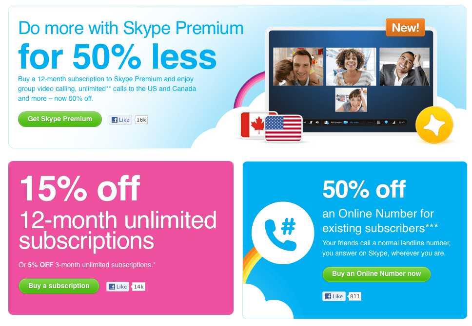
Skype‘s CTA differentiator is its use of numbers to demonstrate value. Most of their CTAs hinge on a numeric offer that prompts further use (mainly subscriptions) and appeal to the visitor’s logic. The bright colors, bubbly font, and trademark rainbow clearly brand it to the Skype identity while the consistent green “submit” button sets the click-through action apart. Going even further, Skype uses social media integration to promote sharing and enable trustworthiness by incorporating online approval from strangers.
Ultimately, your CTA should represent you as a brand and demonstrate value in your offer; the creative details are up to you, your marketing team, and the analytics and A/B testing they’re using.
Have you seen any other great CTAs to add to the list?


