5 Starter Tips for Mobile Design

1. Simplify design
The best way to first approach a mobile design is to think, “simplify.” Two big initial considerations are size and speed: mobile browsers, while getting faster, can still be irritatingly slow, and are only made slower by large files and sizeable amounts of content to load.
Additionally, with smaller screens comes less real estate for you to utilize. Branding becomes increasingly important here, because you really need to strip your content to its most basic purpose, and carefully choose and place elements to represent yourself in such a small space.

Some companies, like Spotify, a music
streaming service, really take the mantra
“less is more” to heart in their mobile design
This isn’t to say that it has to sacrifice design for functionality, just that the two need to live harmoniously. In fact, designing for mobile is a new challenge that invokes creativity in designers.
To see how each brand approaches mobile design, visit the gallery Mobile Awesomeness, which features good and bad mobile designs for inspiration.
2. Use a Single-Column Layout
The single-column layout works hand-in-hand with design simplicity. On a mobile device, many users are scrolling or flipping between landscape and portrait mode, so the easiest way to maintain user-friendly navigation is to keep it all in line: one line, that is. Similarly, when designing a mobile version of your website, it is best to convert your navigation to a vertical, single-column layout. If you have a particularly content-heavy mobile site, use a collapsible navigation that allows users to open or hide particular content.
3. Re-think Visitor Paths By Examining Consumer Needs
A mobile site is not necessarily just a miniature version of the website. Part of re-defining your mobile navigation process is to evaluate why a customer might visit your site on a smartphone or tablet. Often, it is to use or research your products and services quickly. Mobile design should cut out unnecessary content and immediately deliver an easily discoverable path for the visitor.
Take for example Amtrak’s mobile site versus their desktop site.
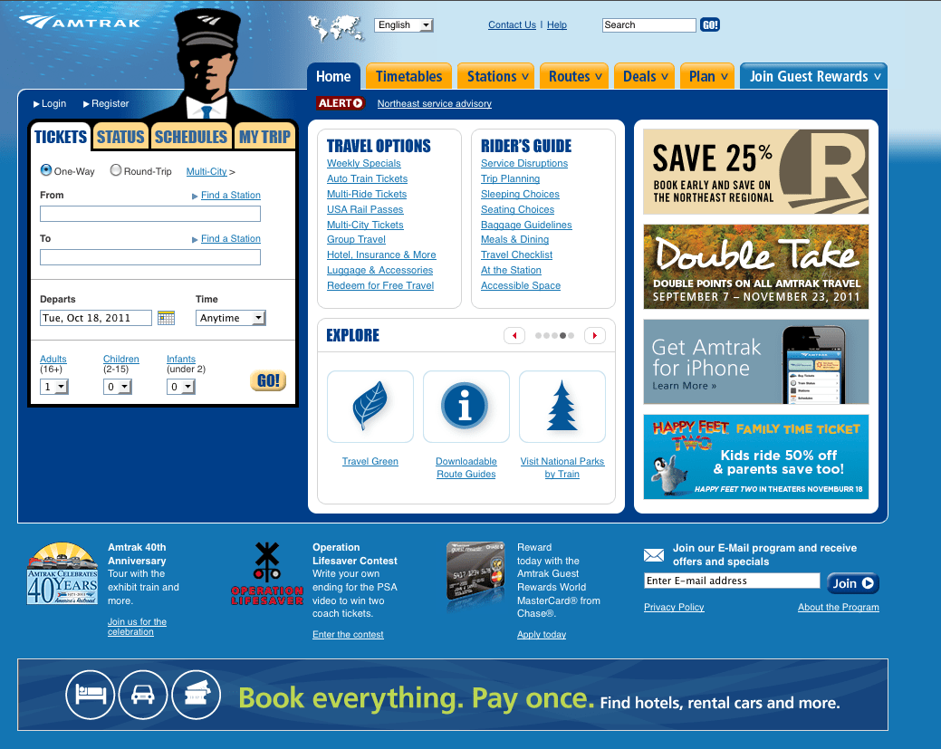
Amtrak’s desktop design is a pretty evenly divided between: buying tickets and organizing a trip, conducting travel research, and offers and promotions. It is fair to assume that someone visiting from their computer could be looking into any of these things.
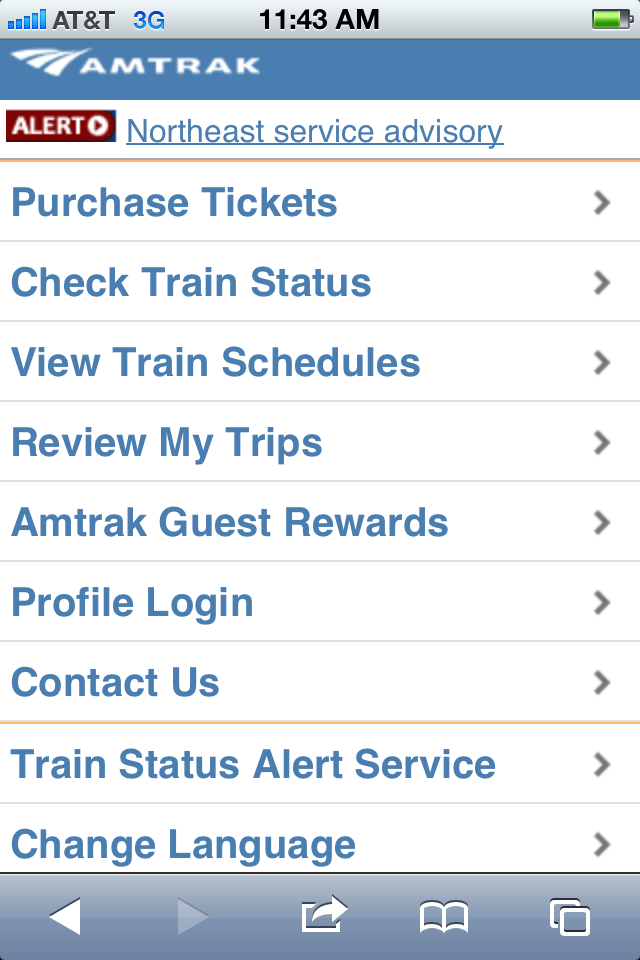
The company’s mobile site, however, is much more straightforward, and assumes that the visitor is coming this way for one reason: to easily and efficiently map out a trip, right now. They eliminate the research portion and deals section to streamline the process according to consumer want, and make their mobile site a tool for the visitor to quickly accomplish this goal.
4. Think In “Taps” Instead of “Clicks”
One of the biggest physical usability differences here is that mobile design users tap where desktop users click. This means that small, numerous links on your website need to be revisited and reformatted as big, tap able buttons, yet another way to reconsider the content that is provided in each format. This also means that there is no option for hovering – a feature that is often used in desktop web design to reveal content.
5. Make Your Original Website Available
The best mobile designs allow for options, and sometimes visitors really do want to visit the original desktop website. Making it easy for them to access it represents best practices when it comes to mobile design.

Zatarain’s, a supplier of New Orleans-style food products, smartly places their “view full site” link next to a newsletter sign-up call-to-action. While the link is in standard web formatting (more “clickable” than “tap able”), it is placed exactly where the visitor’s eye would go to find the link: in the footer.
