Current Trends in Website Navigation
Clients as Information Architects
That our clients have become more sophisticated web users is a reflection of the web not being a new medium anymore. We’re finding that our clients are increasingly thinking like information architects about how their audiences will navigate to desired content. It is a time for web designers to examine long-held notions of what constitutes a good UI.
Best Practices in Website Navigation
At RainCastle, our formative years as web designers and information architects coincide exactly with the evolution of the commercial web. Through nearly 20 years of trial and error—well, not too much error—we observed user behavior and developed website design best practices in the process.
“Best practices” has generally included allowing for some redundancy in navigation to accommodate the fact that some people are more text-oriented while others respond better to images. We felt that providing more ways to get to the right content was better than a minimalist approach. The web was young and people were finding their way.

Accenture’s website is a classic example of detailed navigation. In order to provide their visitors with as much information as possible, on this page they have a top navigation menu, a secondary one with four pages explaining their services, and an additional third one listing all of the services (which is also, in itself, a separate left-hand menu).
Simplifying the Navigation Process
We’re seeing a movement toward simplicity these days. As websites have increased in complexity, users have become correspondingly sophisticated. Where we used to need to go out of our way to devise multiple paths to make sure users could find things, we’re finding now that less is more.
Providing less choices or less levels of navigation, while making it potentially more necessary to explore, appears less daunting for users who are less likely to indulge cascading or redundant navigation.

Yes, I Said Yes is a modern video production company. Their site features a fixed left-hand navigation menu with four items, but requires you to scroll through the site to find their information and work.
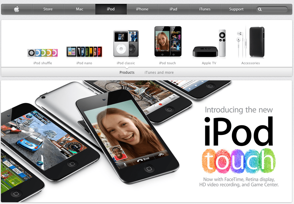
Apple uses a navigation menu with no drop-downs; a rarity for an e-commerce site that wants to feature its products. Instead of pinpointing the one product you want, Apple directs you to a general overview page that allows for further exploration.
