How to Use Color in Web Design
Color can be one of the most important aspects of website design. It involves cultural symbolism, brand significance, and industry norms, and has a strong aesthetic value that can attract or discourage your visitors.
But where do you begin when it comes to using color?
First, here are some things to consider for consistency:
- Ease-of-use should govern everything from color, to font, to use of imagery, to navigation style
- No dark sites with lots of reversed out text
- Use color consistently for headings, body text and backgrounds
- Use colors with the right emotional connotations
- Use color that will resonate with your audiences (e.g., blue /cool tones for high tech, earth tones for woodworking and construction, red accents for sales and retail) These are not hard and fast rules, but starting points
Important uses of color
You should use color strategically to:
- Focus the eye where you want people to read
- Highlight key areas
- Separate or categorize blocks of content
- Create an emotional response
How to Use Color Accents
The way we work around the propensity for predictability is to create a base palette of a safe color like blue and extend that palette with brighter color accents of contrasting colors like orange, red, yellow or certain shades of green. Selective use of color accents is a good way to highlight specific content and raise the emotional temperature.
The website RainCastle designed for Beaver-Visitec International, a medical device company illustrates this approach.
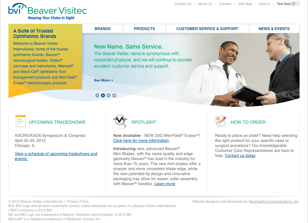
The use of bright yellow highlights key content we want the visitor to read and a bright green is used consistently for headlines. The overall effect is solid company (blue), but also one that is modern and friendly (yellow and green).
Next, consider what color means in relation to your industry.
Color Associations in Business
In a modern country like the U.S., color — when used in a business context on the web — is often stripped of the more symbolic associations. Certain industries have come to “own” colors: In high tech, you see a predominance of blue, in health care it’s blue and green, and retail and sales businesses often incorporate red. Most clients find comfort, even on a subliminal level with the colors prevalent in their industries.
In our own experience, when we’ve shown multiple design options to high tech clients, they have almost always gravitated to the blue solutions. This is because in our culture and this industry in particular, blue is the safe choice. It’s cool, clean, not controversial, works well with other colors and looks good in all shades. Businesses selling software need to convey security and ease-of-use. Blue fits the bill. EMC, a large technology company, is representative of this trend.
The Power of Complementary Colors
Making strong use of contrasting colors can also be an effective way to create some excitement in a website and build a brand. RainCastle’s website for Mark Richey Woodworking is a strong example.
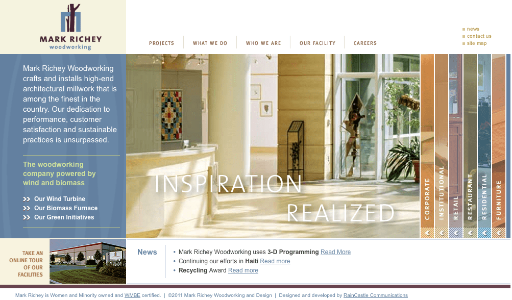
The team at Mark Richey envisioned their brand and website to be represented in earth tones to suggest the many shades of wood, the essence of their business. When we suggested that we build their brand around the color blue, they balked. What does blue have to do with woodworking? When we unveiled the designs, they recognized that because blue is a complementary color of wood tones, putting it next to their work made their portfolio almost jump off the page!
What’s your take? Is there any color in particular that you feel works for your brand? Or are you looking to re-vamp for something more modern?
