How To Make a Responsive Website & Why Your Site Needs This Facelift
In my last post, I discussed the pros and cons of Responsive website design and concluded that, while not perfect, the pros outweigh the cons. Now that you may be ready to take the plunge, let’s talk about what makes a Responsive design successful and why your site may need a face lift.
Start with Audience

From my previous Responsive design post, we understand that a Responsive website design that displays a desktop, tablet and mobile version of the site, is still one design. What is important to recognize next is that even though the site is the same, mobile and desktop audiences aren’t the same and may not have the same needs. Users of smart phones and tablets are usually in transient environments, full of distractions and their need is for easily accessible information requiring as little work as possible. So how do we create 3 successful user experiences from a single design?
Establish User Personas
Begin by asking discerning questions, like: What are the tasks the user will likely wish to perform on each device? Does everything on the desktop need to appear on the smart phone and vice-versa? Does it really make sense for the desktop to have a simple, mobile menu icon, as we’re starting to see on some sites, rather than displaying navigation, which won’t require a click? Doesn’t it makes sense to have an expanded site map in the footer of a smart phone, but is it necessary on the desktop? There are a limited number of things that can be done on one device that will not appear on others and mostly it is about what can be omitted to simplify the experience for each device. These decisions all begin with a study of each user type.
Consider what really needs to appear in the mobile site
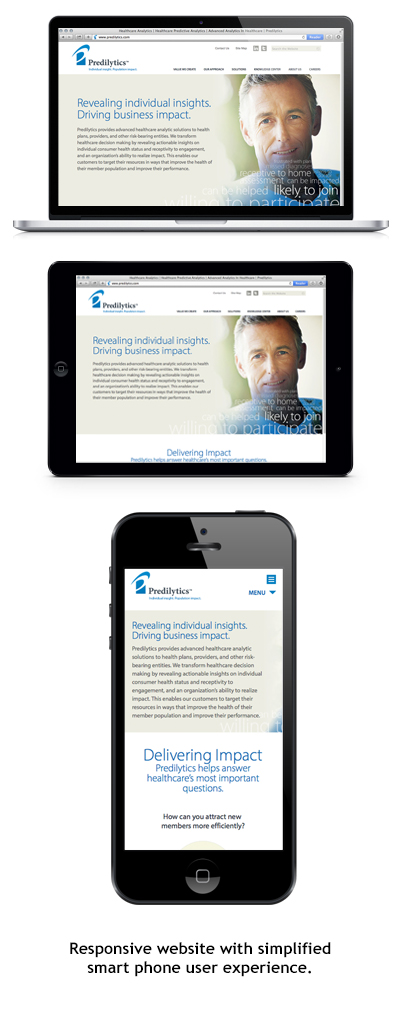
It is important to discuss what aspects of the desktop design show up in the tablet and smart phone. The differences between desktop and tablet are generally minimal as the form factors are similar, but the size and vertical orientation of the smart phone require careful consideration. For example, our sites — like the the site pictured at left — are branded and visual with strong images, diagrams and icons. But when translating to the smart phone, we often recommend removing some of the graphics to provide a quicker, more utilitarian experience for the mobile user who is not interested in scrolling through images to get to the text. As believers in the power of visual branding it pains me a little to make this recommendation, but a smart, responsive mobile experience is about understanding your audience and making the right trade offs.
Educate about mobile user experience
In our experience it can be disorienting for clients when they don’t see everything from the desktop site on the smart phone version of the site. We remind that the mobile experience revolves around scrolling and that everything one sees on the desktop will become stacked in a vertical hierarchy on a smart phone. Thus, images may be stacked above words and the quantity of scrolling before finding valuable content can become tiresome, where finding it was perfectly simple on the desktop. Rather than dumbing down the desktop site into a simplistic, generic experience, we recommend selective ommission of extraneous content for the mobile audience.
Time for a Website Facelift
If your website does not provide a “smart experience” for the smart phone, it is probably time for a website facelift, and with these tips, you have some insight into customizing your experiences to your website visitors, on whatever device on which they find you.
