
Current Trends in Navigation Part 2: Deep vs. Wide
The trend in B2B Website Navigation
In two separate client meetings last week the same question arose: is it better to have deep scrolling web pages that require fewer clicks to arrive at desired content, or shorter pages requiring less scrolling but more clicks?
My first reaction has been that short pages requiring little or no scrolling are preferable to the user and longer, more content rich pages are better for search. Website user experience is a balance between the needs of humans and the demands of analytics software.
Challenging the conventional wisdom of web usability has been a consistent theme of mine this year as our clients have higher marketing goals and expectations for their websites. The huge increase in the amount of website content and multiplicity of pathways for accessing it, have made navigation a labyrinth for which we are the guides.
Inch deep and mile wide or mile deep, inch wide?
I asked a colleague to do an informal survey of B2B websites to see if we could discern a trend toward deep vs. wide, content-rich websites. While we found endless examples of deep, scrolling pages—with IBM being the quintessential example, we were hard pressed to find any sites that contain all content “above-the-fold,” and relatively few requiring minimal scrolling.

IBM doesn’t just provide endless copy for scrolling, but carefully
designs all graphics and layout aspects to accompany deep pages.
Salesforce.com was the best example we found of a user experience consisting of relatively shallow pages with a nice text to image ratio and clear click paths going down four levels.
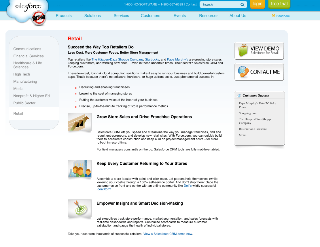
In typical salesman fashion, salesforce.com keeps content short and simple on
each page to maximize reader interest and potential leads.
The long and short of it is that the current trend is for longer pages that tell more of an entire story through text, tabbed content and images.
That isn’t an endorsement, just an observation. Salesforce.com is a legitimate example of a successful company that has maintained a refreshingly simple navigation scheme and has used imagery in harmony with text to make content easy to digest and not overwhelming.
Ease-of-use is still our mantra; the site’s content and a client’s personal preference will be the leading factors in whether the call is deep or wide.
What’s your opinion on deep vs. wide navigation?